Bathroom renovation can make your space more comfortable, appealing, and safer. Regardless of which part of your home you are upgrading, always consider the layout. ow things are placed in a room defines its efficiency, accessibility, and overall look. It also ensures you have a space that meets your needs.
Here are the do’s and don’ts of designing a bathroom layout.
Do’s
Allow More Natural Light
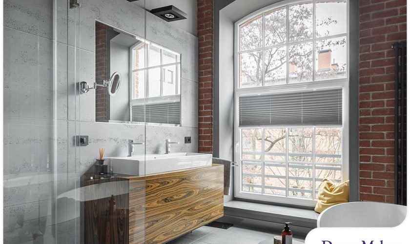
With more sunshine in your bathroom, you don’t have to depend as much on artificial light during the day. As a result, you get more savings on your energy costs. Plenty of natural light will also bring freshness to your space and make it appear larger. Consider placing your sink, tub or mirror near a window.
Measure Before Purchasing
Always measure everything before buying anything for your bathroom remodel. Your shower, bath and vanity should be proportionate to each other. If space is an issue in your bathroom, consider a freestanding bathtub and a smaller vanity. There should be space between your shower or tub and vanity. Experts recommend having a freestanding tub at least 8 inches from the wall and dedicating a foot of space or more at the ends for easier maintenance.
Have Sufficient Storage
If there’s one thing well-designed bathrooms have in common, it’s sufficient storage. Think about this factor during the early stages of your project. Small spaces would benefit from adding shelves above the toilet. Cabinets with mirrors as doors will help you save more space, store your essentials and make your bathroom appear more spacious.
Don’ts
Making the Toilet the First Thing You See
You don’t want your toilet to be the first thing you and your guests see when they open the door. Avoid placing this fixture directly across the room’s entrance. Put it behind the wall or the side where you can’t easily see it.
Having Too Little Lighting
Layered lighting is ideal for bathrooms. With different types of fixtures, you can avoid having a room that is too bright or dim. Avoid placing overhead light on your vanity to keep shadows that make it difficult to do your makeup or shave. Consider wall lights on both sides of the mirror to light up your face from the front.
Failing to Divide Zones
Do you have a spacious bathroom? You can make your space more functional and inviting by creating separate zones. Have dedicated areas for the shower, bathroom, toilet and vanity. Creating zones will make your bathroom more spa-like.
Let’s Start a Conversation!
Only trust a dependable company for your home remodel. At DreamMaker Bath & Kitchen of South Valley, we’re here to bring the best out of your living space. Call us at (801) 410-0909 or fill out our contact form to reach our design experts. Our design center is open on weekdays, from 8 a.m. to 5 p.m. We serve clients in South Jordan, Sandy Draper, Riverton and Herriman.


