Colors wield a powerful influence on emotions and moods, shaping the atmosphere of living spaces. The principles of color psychology guide us in creating a calm and tranquil home. In this article, DreamMaker Bath & Kitchen of Reno provides tips for choosing a soothing color scheme for your interior remodeling project.
Diving Into Color Psychology
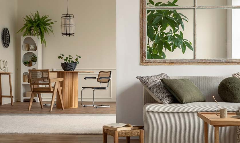
Color psychology studies the emotional and behavioral effects that different colors can have on people. Some colors are known to induce feelings of calm and relaxation. For instance, blues are often associated with a sense of serenity and peace, reminiscent of the sky or sea. Greens, reminiscent of nature, can promote relaxation and comfort. Light purples, like lavender, often create a feeling of restfulness. Understanding these associations is crucial when choosing a color scheme for a serene home environment.
Selecting Your Calm-Inducing Color Palette
When aiming for a soothing color scheme, consider pastels, nature-inspired hues and neutrals. Pastel colors, due to their softened, muted quality, can infuse a sense of calm and relaxation. Colors inspired by nature, such as soft greens, gentle blues, or earthy browns, can evoke tranquility by connecting us to the natural world. Neutrals, including shades of white, beige, and gray, provide a clean, uncluttered backdrop that can help create a peaceful ambiance. Consult a contractor near you for more expert advice on choosing the best color palette for your kitchen.
Implementing Your Color Scheme Successfully
Applying your chosen color scheme across different rooms requires consideration of factors like natural light, room size and the room’s intended function. Light colors can make a small room feel more spacious and are also excellent at reflecting natural light, enhancing the overall brightness of a space. Darker hues, while often used sparingly, can lend depth and sophistication when used correctly.
You should also think about the room’s purpose. Opt for calming colors in a bedroom, and choose slightly brighter yet still calming hues for a kitchen that could use a bit more energy.
Tailoring Your Palette
Color perception is subjective, and individual responses to colors can vary. What feels calming to one person may not feel the same to another. Therefore, it’s essential to tailor your color choices to your personal preferences and emotional responses. Don’t be afraid to experiment with hues that you find calming, even if they don’t commonly fall within the calming colors spectrum.
Let’s Start a Conversation!
Are you planning a home remodeling project? DreamMaker Bath & Kitchen of Reno can provide you with professional assistance. Let’s talk about your vision for a calming home environment. Call (775) 522-7888 or visit our contact page to request a consultation or a kitchen quote. We serve homeowners in Reno, Spanish Springs, Verdi, Truckee, Lake Tahoe and the surrounding areas.


