Color plays a crucial role in shaping our living spaces, influencing our mood and overall sense of well-being. By understanding the psychological impact of color and making mindful choices, we can create homes that encourage relaxation and peace. In today’s post, local interior remodeling company DreamMaker Bath & Kitchen of Central Texas shares a quick guide to crafting serene domestic environments with the right color scheme.
The Role of Color in Our Homes
Color psychology studies how hues can influence our emotions and behaviors. Certain colors have been found to evoke moods that can be used according to the areas of the home. For example, blues are often associated with the sky and sea, evoking feelings of tranquility and depth. Greens, reminiscent of nature, can create a calming and refreshing atmosphere. Understanding these associations can guide you in selecting a color palette that will cultivate a soothing ambiance in your home.
Selecting Your Soothing Color Palette
When choosing a calming color palette, consider soft pastels, earthy tones or neutral hues. Pastel colors like pale lavender or mint green can create a peaceful, airy atmosphere. Earthy tones, such as moss green or gentle browns, connect us to nature and provide a sense of grounding. Neutral colors, like white, beige or gray, offer a minimalistic look that can make your space feel open and relaxed. Color selection can inform a kitchen quote, as it’s not limited to paints; the natural color of materials like tile likewise play a key role. Pair these colors wisely to create a harmonious and calming color scheme.
Implementing Your Color Scheme Effectively
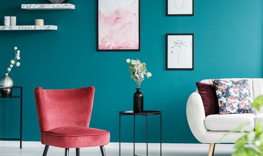
Where and how you apply your chosen color scheme can significantly impact its soothing effects. Factors like natural light, room size and the room’s function must be considered during planning. Lighter hues can make small rooms feel larger and brighter, especially if the room gets plenty of natural sunlight. Darker colors can add depth and coziness to larger rooms, as well as tone down overly-bright environments. Consider the room’s function, too — a serene green might work well in a quiet study room, while a soft blue could bring a calming effect to a bustling kitchen.
Personalizing Your Color Choices
Remember, color perception can be highly personal. What feels calming to one person may not have the same effect on someone else. Pay attention to your emotional responses to different hues. You might find that certain colors, even if they’re typically associated with energy or stimulation, bring you a sense of peace.
Let’s Start a Conversation!
If you’re still searching online for a “remodeling contractor near me,” look no further than DreamMaker Bath & Kitchen of Central Texas. Give us a call at (254) 523-6699, or fill out our contact form to schedule a consultation. We serve Waco, Gatesville, Whitney and Lorena. We also serve China Spring, Woodway, Hillsboro, Hewitt, Groesbeck, Robinson, West, McGregor and Crawford.
