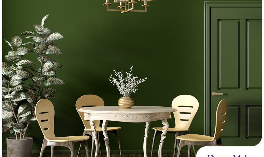
Choosing a color scheme should be done thoughtfully, especially when planning an interior home remodel. Apart from creating visual interest and promoting cohesion and harmony, it can have an impact on your mood and overall mental well-being. If you’re thinking about revitalizing the look and feel of your living spaces but can’t decide what colors to add, a look at what industry experts predict will be 2022’s top paint color trends is a good place to start.
Very Peri
Pantone, the foremost color guide for a wide range of industries like fashion, print, graphic arts and interior design, recently revealed Very Peri (17-3938) as its 2022 color of the year. This is the first time the company developed an entirely new hue for this distinction. The vibrant shade of blue combines the soothing consistency of violet with a subtle but energetic undertone of red, creating the perfect hue to symbolize our transition toward a post-pandemic world.
If you want to give your living spaces an out-of-the-box change, Very Peri should be the focal point of your interior remodeling plans. That’s because it brings a sense of playfulness, especially when paired with lush green tones, neutrals such as taupes and creams, or deeper shades like navy and brown.
Laurel Leaf
A back-to-nature interior design trend is on the rise, which is why numerous paint brands have chosen shades of green to be their color of the year for 2022. Better Homes & Gardens, for instance, picked “Laurel Leaf”, a shade of green with warm undertones reminiscent of eucalyptus leaves. It reflects a renewed desire to incorporate nature-inspired elements into homes.
The organic feel of Laurel Leaf makes it a suitable color to be paired with light to medium wood tones, creamy whites and cozy beiges. It can inspire concentration and focus inside home offices and provide an elegant but subdued backdrop in dining areas.
Gilded Linen
Paint brand Valspar has a collection of warm, natural shades for its 2022 colors of the year. Guided by forward-thinking positivity, these hues inspire curiosity, strength and confidence. One notable color, Gilded Linen, is a simple neutral that imparts grace and sophistication to open-plan spaces. Its soft, versatile tone makes it a great transitional color that can be used for entryways and hallways.
Gilded Linen is well-suited for any room inside your home. To achieve coziness, consider using it in rooms with warm wood tones. Use it on walls to provide balance to interior elements that feature cool shades of blue and gray.
Let’s Start a Conversation!
Need more color inspiration for your home renovation plans? Turn to DreamMaker Bath & Kitchen of Burlington County! Let our specialists help you design an interior space that meets all your needs. Call (856) 656-4488 or fill out our contact form to request a consultation with a designer.


